
ZooEx Design System
Built a scalable design system to unify ZooEx’s DeFi platform UI, improve consistency, and reduce development effort.
I collaborated with product, brand, and engineering to create a robust system of 40+ reusable components and foundational tokens. This system aligned design decisions across teams, streamlined handoffs, and enabled the team to ship features faster with visual consistency.
My Role
UX/UI Design Intern
Team
1 Senior Product Designer, 1 Brand Designer, 2 Front-End Developers
Tools
Figma, Notion, Zeplin
Timeline
12 weeks (May 23' - July 23')
Contributions
UI audit, Component creation, System documentation, Developer collaboration
Problem
The ZooEx UI was inconsistent and hard to scale, slowing development and weakening user trust.
When I joined, ZooEx had no centralized design system. UI elements like modals and buttons were styled inconsistently across web and mobile, creating fragmented user experiences and design–dev misalignment.
Inconsistent UI patterns made the interface feel unreliable and hurt user trust.
Duplicated designs increased dev time and led to bloated code.
Visual misalignment with updated branding reduced design cohesion.
Goal
I focused on building a system that scaled with the product and simplified collaboration across teams.
After identifying patterns of inconsistency and inefficiency, I worked with the team to define focused goals that would reduce friction, speed up delivery, and unify the product visually and structurally.
Solution highlight
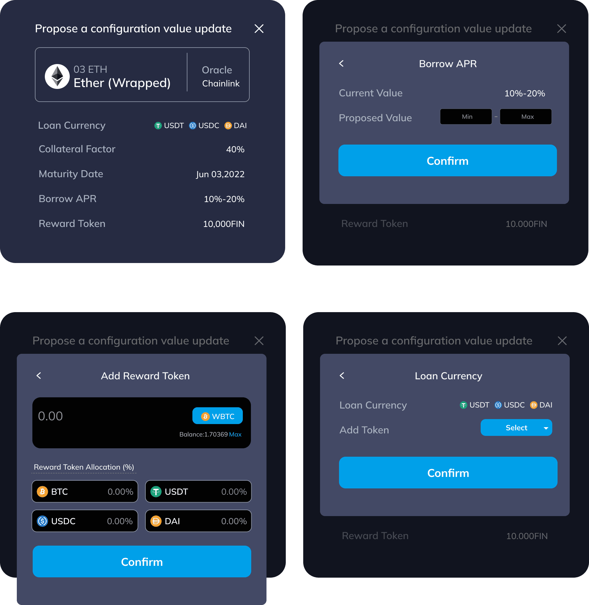
I redesigned modal components as a starting point to drive cohesion and scale across ZooEx’s platform.
As the first step in building the design system, I focused on the most inconsistent UI pattern — modals. I rebuilt them with consistent layout, type scale, spacing, and visual style aligned to the refreshed brand. These updates improved usability and reduced design–dev friction.
Before
Inconsistent styling, including mismatched radii, inefficient layouts, and misaligned typography, created user friction and hindered platform scalability.
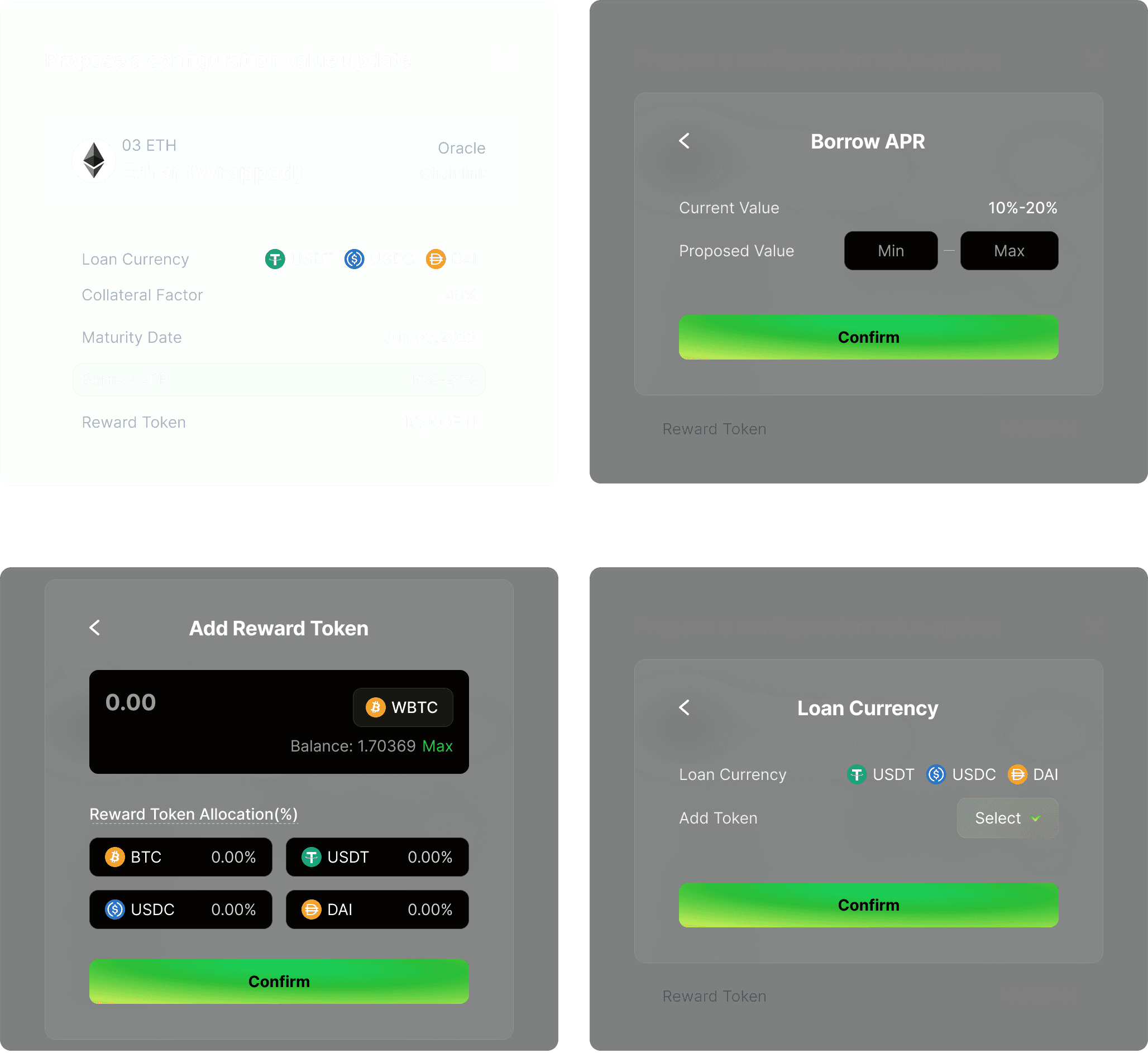
After
Consistent styling aligned to ZooEx’s new design language improved visual cohesion, usability, and reduced rework across teams.
Research Insights & Findings
To uncover the root of UI inconsistencies, I audited modal designs and interviewed cross-functional stakeholders.
To understand the challenges, I conducted an audit of existing modal designs and interviewed stakeholders across teams.
Audit existing modals
We analyzed 12+ modal variations across ZooEx’s platform and uncovered inconsistencies in layout, typography, and interactions. These issues caused user confusion and created friction in dev handoffs.
Stakeholder interviews
I spoke with engineers, designers, and PMs to understand pain points. Developers highlighted rework from building modals from scratch, while designers flagged misaligned buttons and visual inconsistencies.
Turning insights into solution
I defined design principles and built modular modal components to scale consistency across the platform.
Coherence
Unifying look, feel, and behavior across all modals for both web and mobile platforms, aligning with ZooEx’s new branding.
Scalability
Designing modular and reusable components that adapt to various use cases.
Clarity
Ensuring modals have clear layouts, visual hierarchy, and intuitive interactions to build trust and improve usability.
Designing base elements
I established foundational styles to drive consistency, readability, and brand alignment.
Typography
Inter was chosen for its clean, modern feel and strong readability across platforms. The type scale supports clarity in dense, data-heavy layouts.

Color
The palette balances function and brand:
Greens signal trust and growth, neutrals support readability, and soft yellows add subtle energy.

Button States
Defined button variants for all modal interactions. States are clear, responsive, and optimized for consistency across web and mobile.
Icons, Radii and Strokes
Standardized icon sizes and refined stroke widths and corner radii to improve visual clarity and maintain hierarchy across modal components.

Input Fields
Designed input patterns with clear labels, predictable spacing, and flexible formats for values like percentages, dates, and tokens.

Modal Overlays
Defined modal containers and nested overlays with consistent background blur, depth, and padding — enhancing focus and reducing visual noise.

Reusable design patterns
I created higher-level patterns by grouping foundational elements into repeatable modules.

Design system in action
I created components and documented them for ease of use.
Desktop (1024 px)
I designed input fields with clear labels, consistent spacing, and accessible states, to ensure cohesion across the modals.
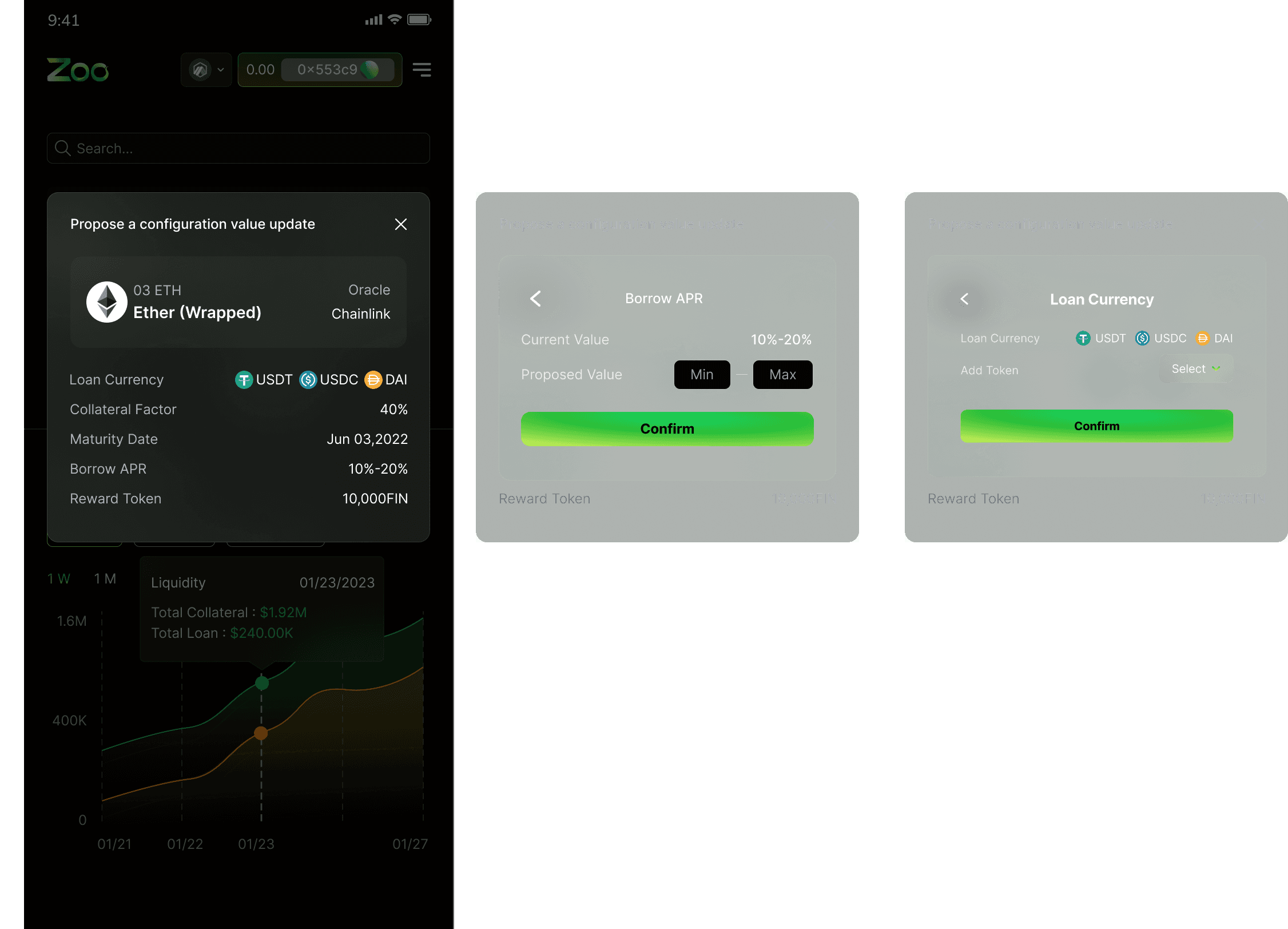
Mobile (375 px)
Components were adapted for smaller screens, with streamlined layouts and spacing to maintain usability without overwhelming the interface.
Reusable design patterns
Collaborated closely with developers to ensure accurate implementation and consistent behavior across platforms.
Partnered with engineers to hand off finalized components through Figma, complete with clear specs for grid, spacing, and interaction states. This ensured smooth integration and maintained visual fidelity at scale.
Impact
We tested the design system with 12 participants, including ZooEx users and internal stakeholders, by applying components in real tasks like form entries, modal interactions, and approval flows.
Improved design consistency
Standardized components eliminated visual drift and ensured consistent UI across all modal types and platforms.
Faster build cycles
Clear documentation and reusable components reduced setup time and handoff ambiguity, speeding up development.
Stronger team alignment
Shared foundations gave designers, devs, and PMs a common language, making collaboration smoother and decisions faster.
Reflection
Building Consistency with Confidence
Working on the ZooEx design system taught me how consistent UI elements can simplify development and build user trust. I learned to collaborate closely with developers to ensure designs were realistic and scalable.
Learning to Iterate and Adapt
I realized how important it is to test and refine components based on real feedback. Iterating on early designs helped me uncover gaps and improve how the system handled edge cases and future needs.