Jump to section


From Confusion to Clarity: Redesigning DiscoverU's Enrollment Experience
As the lead UX designer, I collaborated with our co-founder, developers, designers, and healthcare advisors to simplify DiscoverU Health’s member enrollment experience. The goal was to reduce friction for both insured and uninsured users, improve plan clarity, and better communicate the value of concierge care services.
My Role
UX Designer
Team
3 Product Designers, 2 Developers, 1 PM (co-founder)
Tools
Figma, FigJam,
Timeline
12 weeks (July 24' - Sept 24')
Contributions
Primary Research, Heuristic Evaluation, Competitive Analysis, User flows, High-fidelity prototypes, Developer Handoff
Problem
The enrollment wasn't just broken. The product had no mental model for who it was serving.
DiscoverU Health offers concierge primary care memberships — a genuinely differentiated product in a noisy market. But users weren't enrolling, and the assumption inside the team was that the product needed UI revamp.
Pulling GA4 analytics made the scale of the problem visible fast. The data said the problem was structural.
51%
Bounce rate on plan selection
Half of interested users couldn't make a decision and left.
48%
Drop-off inside onboarding
Users who did select a plan hit friction immediately and abandoned.
< 4%
Enrollment completion rate
End to end, almost no one made it through the onboarding flow.
Solution highlights
Reframed care model and plan structure for clarity, relevance, and confident decision-making across user groups.
I restructured the plan tiers by separating core services from add-ons, removed unclear labels like “65+ only” from under-65 plans, and introduced a side-by-side tier comparison with clear pricing and plan highlights. I collaborated with health professionals and the co-founder to redefine service offerings, making it easier for users to scan, compare, and confidently select the plan that fits their needs.
Simplified the fragmented enrollment into a clear, guided flow for insured and uninsured users.
I redesigned the fragmented form flow by moving insurance selection upfront, splitting complex steps into smaller, logical stages, and showing billing details alongside inputs. This helped users understand their options sooner and reduced errors from backtracking.
Impact
Post-launch, enrollment improved after we clarified eligibility early and kept total cost visible through checkout.
34%
Bounce rate on plan selection
Gave users enough clarity to stay and decide.
20%
Mid-funnel drop-off rate
Routing users to the right path early removed the friction that was removing momentum mid-flow.
18%
Enrollment completion rate
The biggest shift. Users who previously hit a wall were now completing the full flow.
Process
I led discovery through validation within a tight 12-week timeline, helping the team stay aligned with product deadlines.
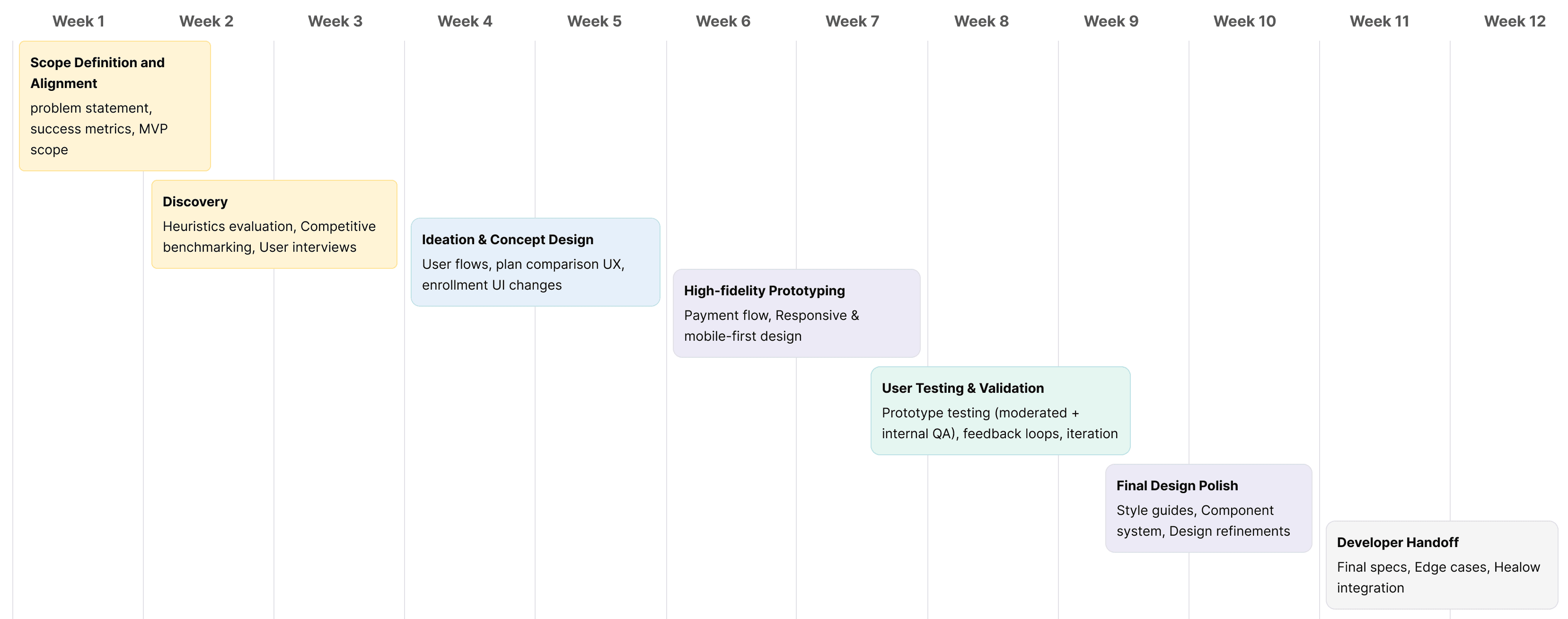
Discovery
Instead of redesigning in the dark, I ran a heuristic audit to create a clear set of usability bets to validate.
The instinct from stakeholders was a UI refresh. Before touching a single screen, I audited the existing flow — to build a case for why a surface-level fix wouldn't be enough. The heuristic evaluation surfaced issues across three critical stages. Each one compounded the next.
Start of the flow
High error cost: Redundant inputs, no inline validation.
Lack of orientation: No progress clarity, no plan summary.
Uninsured gap: Zero guidance once users said "no" to insurance.
Mid flow
Add-ons ambiguity: Optional services were presented without clear value or pricing.
Verification uncertainty: Insurance verification appeared mid-flow with no explanation of when or how it would happen, especially under HIPAA sensitivity.
Checkout
No confirmation of success: Users completed payment with no clear confirmation or next steps.
Price confidence gap: Total showed $0 until card entry.
Hidden add-on cost: 65+ users selecting home care had no visibility into additional pricing until the last step.

2
1

2
3
User Interview insights
The analytics showed where users dropped. I needed to know "why" they didn't come back.
With a tight timeline and no research budget, I recruited 10 participants through internal networks to confirm the patterns the data was already suggesting, and to put language to the friction and hesitation the users were feeling.
Trust barrier 01
" Will my insurance even be accepted here? "
6/10 users found mid-flow insurance verification trust-breaking. They'd selected a plan before knowing if they even qualified.
Trust barrier 02
" What am I actually paying for in the plans? "
8/10 users couldn't tell if add-ons were optional or required. Pricing appeared at checkout, a confusing moment to introduce uncertainty.
Trust barrier 03
"What's the value of a concierge plan over my existing insurance?"
7/10 users couldn't understand what the concierge plan added on top of their existing coverage. It felt like an upsell, not a value.
Design opportunities
Three patterns kept showing up. Each one became a design question.
The flow was sending users down paths they couldn't complete.
How might we design distinct enrollment flows for users above and below 65, with added support for older insured users?
Users weren’t prompted to check insurance early, leaving them unsure about eligibility and which plans applied.
How might we introduce upfront insurance checks to guide users into the right plan flow and reduce confusion?
Users couldn't clearly tell what’s included in each plan and what’s considered add-ons, especially during or before checkout.
How might we make plan coverage and add-ons more transparent to support confident decision-making?
Design Opportunity 1
How might we personalize the flow based on insurance status to reduce friction and show relevant plan options?
User flows
I redesigned the enrollment flow to clearly separate the experiences for users above and below 65, tailoring each path to match their coverage, care needs, and expectations.
The original enrollment flow treated all users the same, regardless of age or insurance coverage. This led to confusion, drop-offs, and misaligned care selection, especially for users above 65 with Medicare.

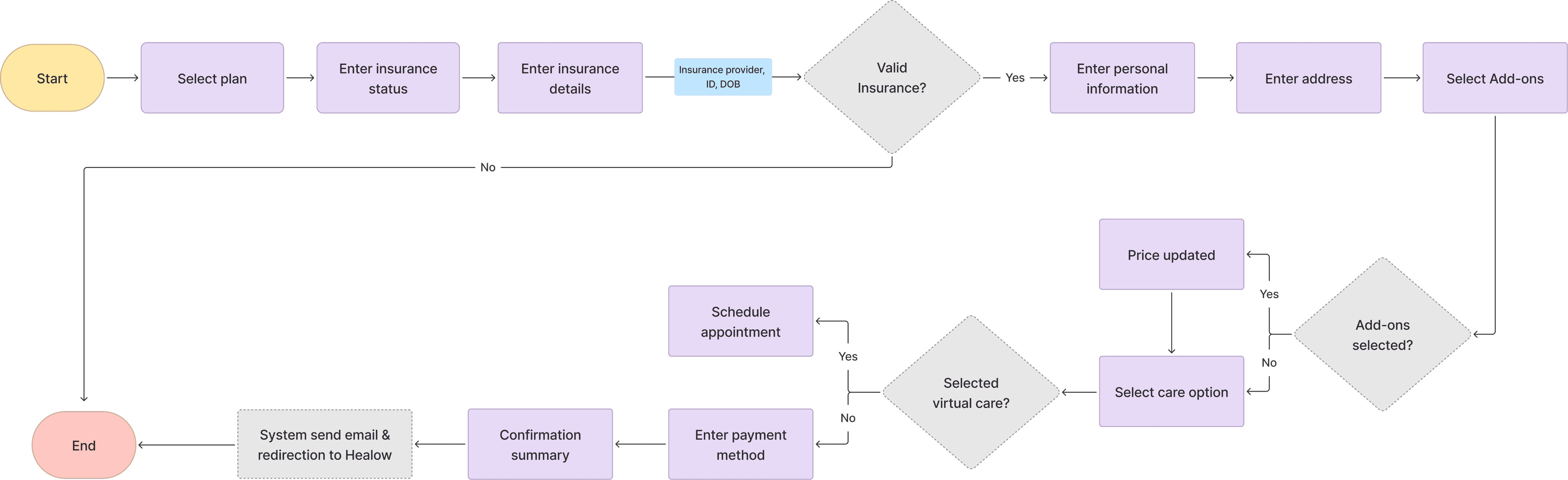
Design Solution
Tailored enrollment path for above 65+ users.
While both flows shared core design improvements, the 65+ user flow included specific additions, clearer representation of add-on services, the ability to choose between virtual or home-based care, and progressive disclosure to reduce complexity.
Highlighted recommended add-ons based on Medicare, Medicaid, or private insurance.
Added home-based and virtual care options before payment to set clear care expectations upfront.
Kept selected plan and pricing visible throughout the flow for clarity and context.
Design Opportunity 2
How might we introduce upfront insurance checks to guide users into the right plan flow and reduce confusion?
Validating designs with users
I ran quick usability tests to validate early layout options and improve the insurance flow.
To test how users understood eligibility and uninsured plan selection, I conducted rapid concept testing using clickable prototypes. I compared three layout variations with 6 participants to evaluate clarity, decision confidence, and ease of navigation. Insights from this helped inform the final direction and reduce user friction.

Opt 1
Pros:
Simple UI, fast to scan
All-in-one view
Cons:
Lacked healthcare-specific context
No guidance for users without insurance

Opt 2
Pros:
Split section with summary
Full pricing and billing breakdown upfront
Cons:
Add-on selection was cluttered and disconnected from the care plan context
No support for users without insurance
Opt 3
What worked:
Clear question upfront guided users into the right flow
Progressive disclosure reduced overwhelm
Uninsured users had a clear entry point
Add-ons separated into a dedicated screen, improving focus and decision-making
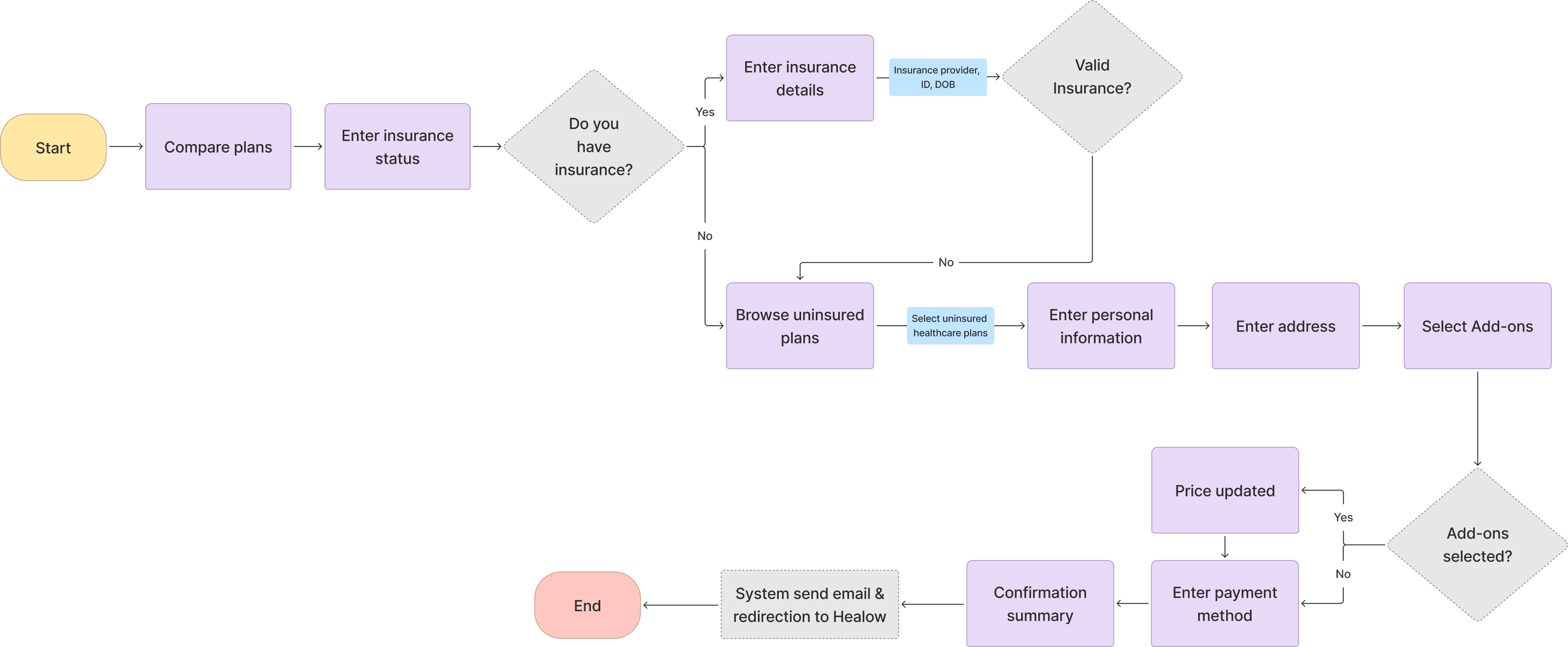
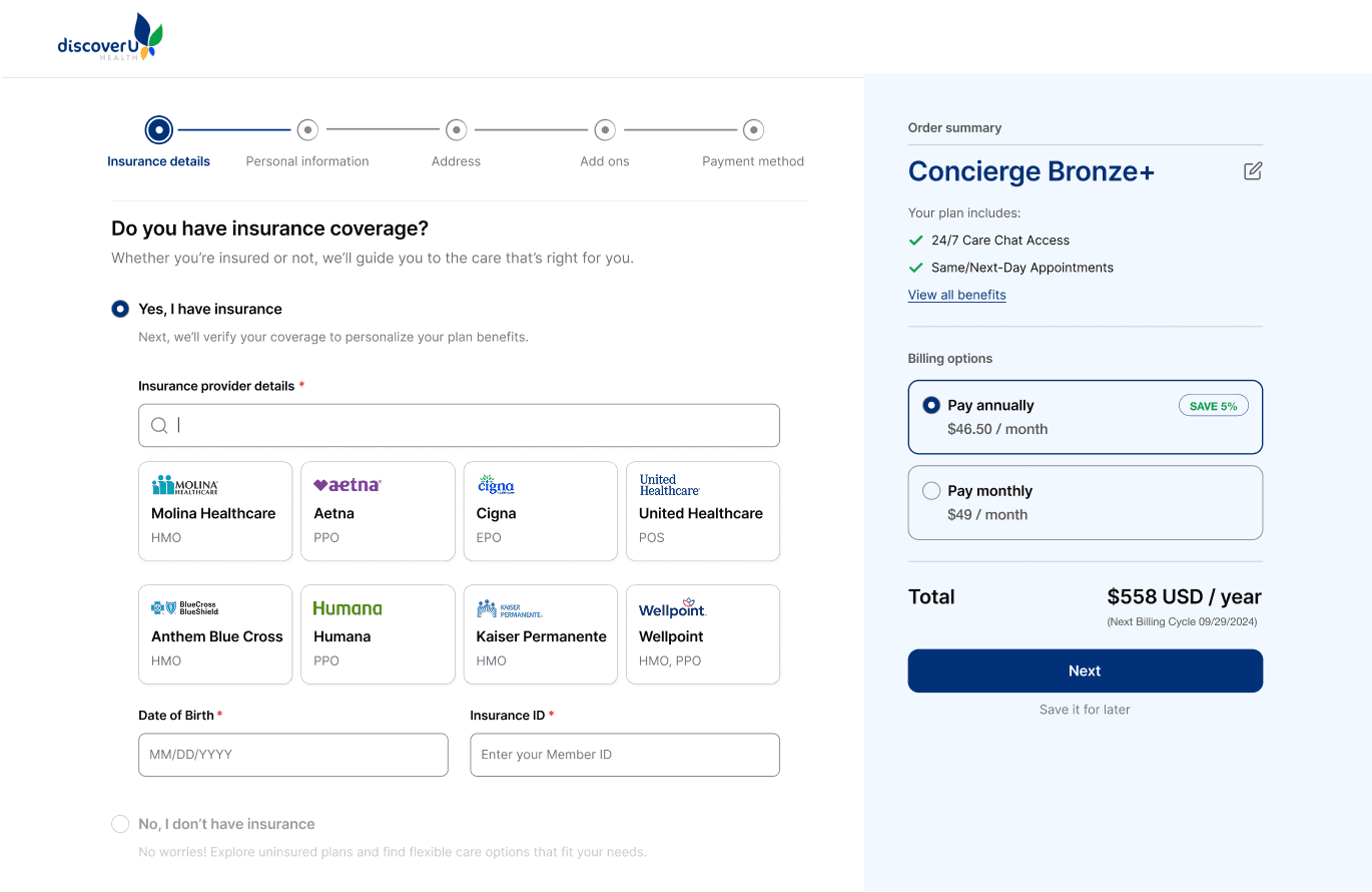
Design Solution
Checking insurance status upfront to guide users into the right plan flow with clarity and continuity.
I redesigned the flow to collect insurance details, provider, ID, and DOB, at the start. This allowed the system to validate eligibility early and guide users into the right flow (insured or uninsured), reducing friction and improving plan clarity.
Captured provider name, ID, and DOB early to validate coverage before next steps.
Redirected users with invalid insurance to relevant plan options.
Grouped key inputs fields to reduce backtracking and confusion
Design Opportunity 3
How might we make plan coverage and add-ons more transparent to support confident decision-making?
Stakeholder discussions
I restructured care plans structure to help users understand what’s covered by insurance and what’s included in concierge services.
To reduce confusion and align care offerings with real user needs, I collaborated with the co-founder and healthcare professionals to redefine plan tiers, clarify add-on services, and segment offerings by coverage type and age. This work laid the foundation for a more trustworthy, relevant enrollment experience
Design Solution
Simplifying plan selection to support confident decisions
After aligning with stakeholders on which services belonged in DiscoverU Health’s core offerings, I redesigned the plan layout to highlight coverage differences and make pricing more transparent. I also integrated it directly into the enrollment flow, allowing users to confidently revisit and update their concierge plan mid-way without losing context.
Let users switch plans mid-way during enrollment without losing progress.
Enabled quick toggle between monthly and yearly pricing for easier cost comparison.
Added ‘View Benefits’ link in the order summary to let users revisit offered services.
Reflection
This project challenged me to design for a complex, real-world healthcare experience, balancing business needs, user expectations, and technical constraints.
This project challenged me to design for a real-world healthcare experience, balancing business goals, user expectations, and WordPress-based technical constraints. Beyond solving usability issues, I helped influence how DiscoverU defined its offerings, communicated value, and structured internal design and handoff processes.
Constraints
Technical stack
The platform was built earlier on WordPress, which limited flexibility in layout and interactions. I had to design within these implementation boundaries.
Ambiguity in plan offerings
The concierge care model was still evolving, which meant the product definition was unclear at times and required close collaboration with stakeholders.
Learnings
Design starts with asking better questions.
Digging into why users weren’t enrolling helped uncover deeper problems with messaging, structure, and flow, not just UI.
Clarity = conversion
Small design elements like early insurance validation, “popular” labels, and simplified comparisons reduced decision fatigue and helped users move forward confidently.
Team Impact
I didn’t just design screens. I helped shape the product, team processes, and direction at a startup level.
I introduced a more structured Figma handoff system with detailed flow logic and component documentation, which reduced dev back-and-forth and improved launch velocity.
The new structure also helped marketing teams align messaging with actual user needs, leading to more targeted acquisition strategies.